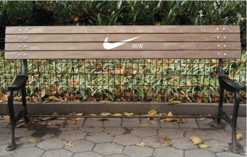
VOLVO LIFE PAINT
This is pure genius. Volvo bringing renewed relevance to their core brand attribute, safety, whilst broadening their brand consideration to all road users.
(Source: youtube.com)

VOLVO LIFE PAINT
This is pure genius. Volvo bringing renewed relevance to their core brand attribute, safety, whilst broadening their brand consideration to all road users.
(Source: youtube.com)
Branding Planet Earth
Oska Pernefeldt set about defining a flag for Planet Earth to remind the people of Earth that we share this planet, no matter of national boundaries; to provide a common identity, inspired by the Milky Way. Oh, and of course to be used to representing planet earth in the off chance of galactic visitations. Best be prepared.
Joking aside it is an impressive personal project. Images and details can be found on flagofplanetearth.com
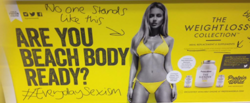
Protein World run their ‘ARE YOU BRACH READY?’ campaign in London and elicit a massive public backlash.
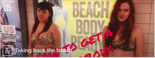
Taking
back the beach launch on Facebook to organising a massive
version of the photo at 3pm on Saturday 2nd May. All types and sizes invited to
demonstrate that you do not have to be a model to wear a bikini.
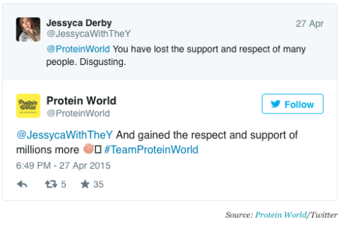
The battle rages on Twitter,. Jessica (with the y) is pissed and Protein World, high from the unexpected uplift in publicity and sales (£1million in direct sales revenue ta-verry-much) don’t give a toss, and say so. Naughty protein World!
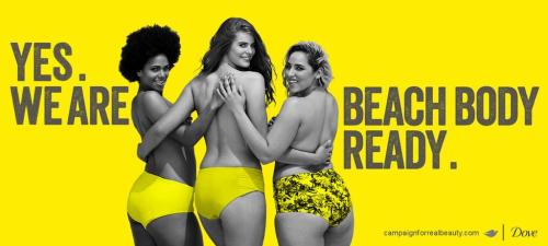
And Dove, with a stroke of pure genius, piggyback to elevate campaignforrealbeauty.com.
Nice.
Genius.
2 Euro T-Shirt vending machine - Would you still buy it, when you see the little kids who was sewing it? I doubt… Very nice social experiment.
(via helloyoucreatives)
I am an idealist to the core; so a large part of me was hoping for… hope. I am still hoping.
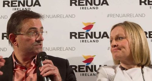
Political brands operate to the same principles as any other brand. Yes the stage is different, but the principles are the same: how are you positioned v the competition: what is your core purpose, reason or belief that defines you and how is that core purpose going to deliver an experience that is relevant, through branded offerings - in the case of political parties: through it’s candidates.
At the core, stereotypical level, Renua would seen to be relatively undifferentiated. I want to avoid dragging myself into political commentary here, because it is not my specialty, however their policies confuse me and leave me with no real sense of raison d'être or distinct positioning. To cap it all they would seem to be positioning themselves in the most crowded and undifferentiated place: the centre, or worse still, a less relevant positioning: centre right.
Lucinda Creighton, the party leader explains, “I consider the old political paradigms of left and right to be completely redundant now. As far as I’m concerned, the right-wing model of an overriding free market has completely failed and, equally, I don’t think I need to explain how socialism has failed in the latter part of the last century”.
That is all well and good but it does not excuse a positioning that falls between the stools and fails to define itself.
I cannot but help think that in the rush to stick it to Fine Gael; to get in position for next years elections, they failed to take a step back and develop a strategic core and positioning for the party. They have failed to connect this to associated policies and glue it to credible candidates.
Looking at the branded offerings of Reua, at the top level, the odd couple, politician Lucinda Creighton and media personality Eddie Hobbs. Two marmite personalities if ever there was. The 170 declared candidates, a disparate collection with limited political experience and no cohesion. It is just hard to get a sense of who Renua really is.
They are of course new, and learning. And they have formed and launched in less than a year, with Lucinda having a child in mid flow. Lets see what happens. Mind how you go though. Whilst you are busy blowing hot air in the centre, the Ross Alliance are planning to lock horns with a more ‘radical’ offering and Sinn Fein are strategically positioning themselves in the relevant left, wooing voters away from a failing Labour. Their eye is on the prize; power on both sides of the border on the anniversary of the Easter Rising and the birth of the Irish Republic.
Once upon a time, not long ago, there was a ‘Hard Selling Sales’ person, overly agressively trying to sell you on the Product on the ‘sidewalks’ of life, and you walked by and ignored him… People don’t buy what you do. They buy why you do it. People don’t buy function first, they look at the emotional narrative, so they can justify the purchase. Then the person sells themself on the functionality or utility of the product (or rather suduce themselves into justification). The emotional narrative is a story. A story of beauty, a story of desire, a story of status, story of seduction, a story of POWER…(at Plato’s Cave)
Jey Van-Sharp of MyUberLife
Could not say it better myself…
Cans as currency: Innovative idea. Great execution.
The idea is simple, short of cash? well collect cans. 10 cans = a cheese burger. 40 cans = a Big Mac.
The campaign began during Swedish music festival “Storsjoyran” and will be traveling to other festivals throughout the year and next summer.
FICTION MEETS FICTION
Lego posters stop you in your tracks. Homerine?
Great work by Alexandre Tissier, Buneos Aries based art director, morphing different pop culture characters to create a range of new characters: Batkid, Spiderbond and my favorite, Homerine.
Lego, basically a bunch of plastic building bricks, have never been limited by their physicality. Imagination knows no bounds, from the New York based brick artist, Nathan Sawaya to reception desks, pop icons liked the Beatles and even Banksy have provided inspiration for lego creations.
Must be some in the attic somewhere…
CREATIVITY AND THE ROLE OF THE ALBUM COVER IN THE MUSIC EXPERIENCE
I had a discussion with my daughter recently about the music industry and how it has changed, specifically about creativity and the role of the album cover in the music experience. She has often marvelled over my record collection: how a conceptual cover creates a context for the music and how the inner pages build a story around the artist or band. This, tactile and immersive nature of the music experience is very much different now. Not necessarily worse… although, we were lamenting the passing of such a rich and personal connection with music. She is a musician herself.
One such album, that had a massive impact on me, was Pink Floyd - Wish You Were Here, with its conceptual, captivating cover.
What fascinates me is the creative process deployed in by Storm Thorgerson, the creator. He regarded an album cover as “one form of art paying homage to another” and whereas the artist may not fully understand the meaning of a song, his (Thorgerson) role in designing the cover was to find the underlying obsession that drives the music.
When Thorgerson asked Pink Floyd ‘what is it all about’ they replied, ‘we don’t know’. He then spent considerable time with the band, over the period off a month, before he truly understood the obsession behind the song; it was about absence and alienation.
The album cover depicts 2 businessmen shaking hands, one is being burnt: implying the malignant motives or fear on communications under the mask of friendship. The back is a transparent salesman hawking Pink Floyd albums on the middle of an empty desert: implying the record company knew nothing about the music they are going to sell.
This investment of time to uncover meaning is not unusual for Thorgerson. When they (Storm Studios) took on a band they would play the music over and over, write out and rewrite the lyrics in order to understand the underlying obsession that drives the music. This would then fuel the inspiration for the artwork.
The integrity of this approach is truly inspiring. The search for true meaning as a source of inspiration is evident in the work and the resulting homage between art forms provides an experience that is sadly rare these days. Maybe the work of Daft Punk (Bangalter and de Homem-Christo) is signalling a revival…

I am a brand and creative strategist, facilitator and problem solver.
In my work I am an advocate of the power of purpose and meaning as an influencer and catalyst for building compelling brands. I have advised government, charities and clients on brand challenges, specifically on the power of purpose driven brands to deliver change, relevance and differentiation.
In the delivery of brand, I strive for simplicity and humanity. I am a firm advocate of co-creation. I also make darn good pizza, but not necessarily at work.

László Moholy-Nagy, Construction, 1924. Oil on canvas. Permanent loan of Commerzbank AG, ...

The tools you use don’t matter. What matters is that you evoke a galvanizing emotion within in the...
“I came all the way from Wisconsin for a costume contest. I got beat by an eleven year old Grim...

qohr:
meat without feet
718-893-0066